
Wednesday, June 2, 2010

Saturday, May 22, 2010


One of my original influences for my colour palette was Marie Antoinette, the film by Sofia Coppola, and the Wallace Collection. SO now I'm questioning how I'm going to hang my show with all of the work constantly changing, I'm revisiting the Wallace Collection for any more further ideas on the hanging.
The Great Gallery (see top image) has lots of large infamous works all in the one room. It's sometimes overwhelming I find, but in a good way. In a sense you're more likely to take the whole of the room in as one piece, rather than each painting individually. However; do I want this for my work?
I quite like the dialogue of the advertising images being considered as the public's property, just like the Wallace Collection is considered part of the nation's collection/heritage. Who own's images?
I feel that scale brings alot of this into question further, we have these images imposed upon us, does that action mean that the only way to deal with them is to just further accept them as part of the environment, part of the metropolis. Letting them fade into the buildings we can block them out. Or can we?
The Boudoir at the Wallace Collection (the pink room above) is alot more intimate, and realistically more similar space-wise to what I have for the degree show. It also seems to be just a room full of women's faces, which is one of the key parts of my work, "The Look", "The Face" etc, and the tedious format of constructed images of women.
Luckily I don't have furniture to negotiate with, but I do have the two long tall skinny lightboxes. It's going to have to be a case of making the work (all wet stuff next week) and then getting in the space and playing. Ultimately there will be two lightboxes, some large poster work, and some super large poster work!Thursday, May 20, 2010

SO the magazine images have now become pretty fragile. Hours of taking them on/off off/on the lightbox has meant I'm not that happy with how much they may deteriorate.
The need to have something slick, something believable and something that would last the whole show, has led me to this.
A return to my love and use of collage. Driven by my desire to make something both attractive and repulsive, has led to this.
I will be making a longer collage based on this shape for the long skinny lightboxes.
All really exciting this week, other stuff has happened/emerging, but until it's more in place, my lips are sealed....
Monday, May 17, 2010


Continuing from the dissected shapes, here is an experiment of merging the faces together. I'm happy with it. It exaggerates the transparency and plays on the shapes further.
Today we had a meeting in the space we'll be exhibiting in, its just me and four super talented young female artists. There's gonna be a few installations, some clever sculpture, all really exciting!
The hunt for lightboxes continues, I want super quality to show off the shapes and the concept in general. Tomorrow the quest for images continues too, I'm collecting my Chloe bust shelter poster....Yikes!
Sunday, May 16, 2010
Destruction
Yesterday I went to the "No Soul For Sale" installation at Tate Modern as part of the Tate Modern 10th Birthday celebrations. One of the things I picked up was a newspaper style booklet called "Speaking of Destruction...", a beautiful publication produced by the Swiss Institute for the Under Destruction show at Swiss Institute New York.
The Booklet contains quotes from people on destruction, relevant to my work I picked out two of the most poignant ones for me and my practice:
"The impulse of modern art is the desire to destroy beauty" - Barnett Newman.
"I always said punk was an attitude it was never about having a Mohican haircut or wearing a ripped t-shirt. It was all about destruction, and the creative potential within that."
- Malcolm McLaren 

Here is an image of some of the work at the moment, at the moment the colours are too reminiscent of Kirsten Glass' stuff for me. But I like the dissection of the image and the further emphasis on the shapes. The writing you can see is the work of James Ashby King who also works on the window in my studio.
Tuesday, May 11, 2010

Tried cutting the shapes out and then piercing them and then fitting them together... This feels like it's more my imposed composition of the images and takes them away from the original creator; but what I most excited about is how this will translate into a large scale piece with pieces cut from large advertisements....
Monday, May 10, 2010
"If Nothing ever changed, there'd be no butterflies." - Unknown.

So the usual drama has ensued after several tutorials and finding out where my degree show space is, the work is changing!
The pierced works have received some really great responses, which has been really lovely.
Now I'm struggling with trying to make the show a cohesive representation of my work, and how Chelsea has shaped and informed my practice.
So do I keep Maria Gunning or not? Do I get a nice plush, albeit financially demanding, light box for the show?
I also have been given two walls in the space, which is at DG06 right by the parade ground at Chelsea, really lovely! I want to make the most of those two walls, so expect more things changing I guess....
Saturday, April 24, 2010

Thursday, April 22, 2010
"Deadly Coral"
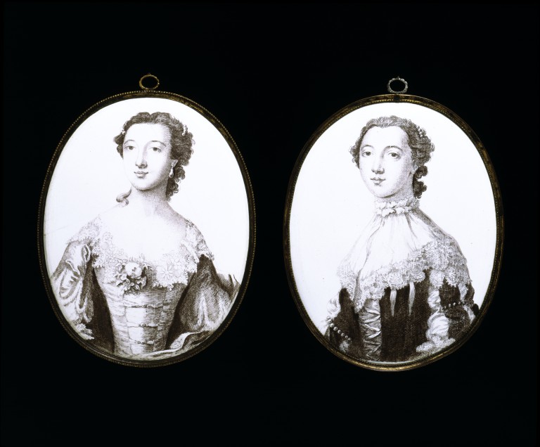
I love the Wallace Collection. I bought a book for a pound there the other week, really thick and it's a catalogue of all of it's miniatures.
Over Easter I researched some of the women in the miniatures, purely out of my own sad curiousity.
Some of the lives these women had were so incredible, incredibly amazing and for some, incredibly tragic.
One that stuck out for me was The Countess of Coventry Maria Gunning. From a poor family, her and her sister set out to be actresses. In October 1748 the beautiful sister's were invited to a ball at Dublin Castle. With no suitable attire they borrowed some frocks off a theatre, the costumes for Lady Macbeth and Juliet. This party proved important, Maria's sister got them a pension. They then became celebrities and social beauties.
Maria married the 6th Earl of Coventry eventually, becoming the Countess. For the honeymoon the couple travelled around Europe, including Paris. On the trip her new husband refused to let her wear heavy rouge make-up, which was very much in vogue in the capital at that time, he even tried to rub it off with a hankie when she wore it to dinner one night.
When they returned, Maria apparently continued to wear vast amounts of make-up heavily, because it was stylish. She died aged 27, of led poisoning from the cosmetics, earning her the title of "Victim of cosmetics" among society circles.
She's going to be the centre piece of my exhibition with coral red poured onto her. Titled "Deadly Coral" I'm hoping it will tie the idea of poison mentally and physically with cosmetics.
The Start...

So I've started this blog so that I can chart, for myself and others, what it takes to do a Fine Art Degree Show....
The degree show proposal is awaiting tutor approval as we speak.... *cripes* Here is the proposal:
Three large works on board. Two of them will be adapted large scale poster works, each poster measures approximately 0.5m x 1.5m. These will be large shop beauty/cosmetics adverts with house gloss paint poured onto them after a treatment below of PVA. In between these two works, will be a large scale photocopy (measuring approx 0.5m x 1m) of Maria Gunning Countess of Coventry, the photocopy will be of a print of a miniature of her from The Wallace Collection. The miniature is set in an ornate frame which will also be in the photocopy. The large photocopy image will be backed onto a jigsaw cut board. The other images will be on rectangular board. All on a beta hanging system. The colours of the house gloss paint will be coral red, baby turquoise and baby lilac.
Over Easter I did some new stuff which may or may not feature in the final degree show, I was working with the idea of "controlled destruction" something that was starting to creep into the work.
Ok so, this work below took about 3 days of a tedious but pretty satisfying process, tiny holes into a magazine advert for a fashion house. I was trying to obliterate everything but the bits I noticed and created anxiety and pleasure for me.

This was the start of it, and the effect of the white dots is actually light shining through the holes from a light source.
Will post more images of the finished and utterly obliterated piece when I find a bad ass lightbox.
This idea came from messing about with this:

Both these pieces led me to the idea that I am eating away at the images that eat away at me.
Subscribe to:
Posts (Atom)